This is all in one tool to make any kind of sliding panels and popups. These are common scenarios for usage
- Login panels
- Toolbars
- Mobile menus
- Mega menus
- Popups
- Lightboxes
- Advanced Tooltips
- Popovers
- Toolbars
Greenshift has Sliding panel block and Sliding Panel Interaction Action
Sliding Panel Interaction Layers
To use this option, enable the Interaction layer on any block, for example, on the button. Then, select a trigger; it will likely be Click, but you can also use Mouse triggers or any others. Then, select Panel Action and click on Create Panel. This will make a panel block on your page. You can use anything inside this panel. Also, you can change the styles of panels and animations.
Example
You can use it even for making advanced sliding navigations. Check demo
This feature can be used also to make advanced popovers and tooltips
You can control place of popover. Popover block is using position-area option. Check more details about Anchor API
Sliding panel / Popup block
Alternatively, you can use also special Sliding panel block. This block is a variation of the button block that also includes a panel. After adding to the page, click Open Panel in Inspector, and this will open the panel; you can add their other blocks.
Use the "Place panel in Footer" option if you have problems with overlays on-site
See some examples. Click on buttons
Right side panel
Block sliding panel
This kind of panel is placed inside the block itself and can be used to make tooltips, mega menus, etc. Click on the button below.
Here is also example with replication of Aliexpress menu. This works also for hover effect.
Popup and Modal
You can use it also for popups. It can be not only for click on the button but also auto popup with a timer, close intent popup, or popup with a custom click trigger
The difference between modal and popup is that the latest uses the modern browser Dialog feature. It should prevent any issues with Z-index but has fewer options for design.
Dynamic Content Feature
This block also supports dynamic content. You can add any CSS selector from your site and the block will copy its content. This can be useful, for example, when you want to turn desktop content into a mobile toggle. For example, this can be used for filters on shops. On a desktop, you can show all filters, because products and filters are visible, but on mobiles, more practical to hide filters to buttons. The idea here is to disable the button on the desktop and hide filters on mobile
Cookie option
There is also a possibility to save/delete cookies and body classes after a button click. This can be used if you need a custom cookie banner or GDPR notices.
Custom close button and custom trigger button
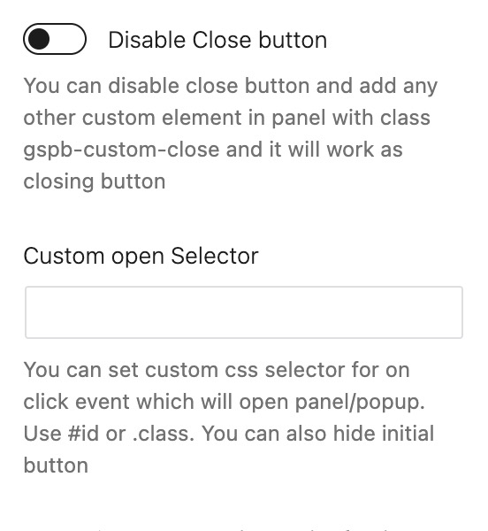
You are not forced to use this block as a button with the trigger. You can disable the button and set the custom CSS selector to be a trigger. The same is for the closing button. You can drop the button block inside the panel container, style it as you wish, and set the class of the button as a custom close button

Auto trigger timer
This block has the option to trigger a popup after some time. It can be used as promo popups or for subscriptions
Exit Intent Effect
You can also enable popups and buttons to indicate exit intent. If user leaves your page, a popup will be triggered automatically


